Tuesday, 6 December 2011

Evaluation - Q4

How did you use media technologies in the construction, research, planning and evaluation stage?


I shall break this up into four sections which are construction, research, planning and evaluation.

Media has been using convergence for the past 10 years, continuously trying to find a way of improving different technologies. Because of this, I felt it was important to different pieces of media like, computers, magazine, phones for our research as this would be the things we would need for our work. 


Research


The brief states that we have to produce a music promo video, and the internet gives you endless information, especially on the website http://www.youtube.com/ showing different music videos as inspiration. The website allowed me to type in artists that have similar connections to Just Jack, for instance, Joshua Radin. Research is incredibly important in the second year as you have to find generic conventions of your artist and others to show good research that you are able to relate to, picking out elements but whilst not copying! Along with YouTube, Google was a search engine which allowed me to find further information about the artists. I particularly found myself looking at their Wikipedia page because even though people can hack in and change information, the box on the right hand side (shaded in yellow) shows what genre artists belong to.

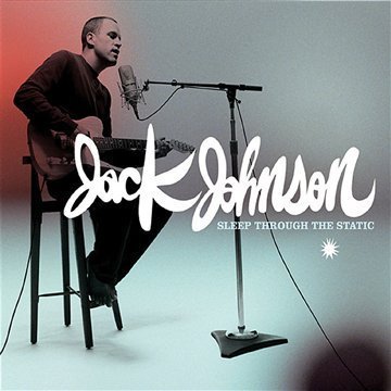
From looking at YouTube, I could access his music and then find more information and see whether this promotes any ideas for stuff to go into my music video or why I would do anything differently. There were other artists from the genre that I researched, such as, Jack Johnson and Newton Faulkner, seeing different things that I liked in each video, and trying to bring them together, mainly basing it on a amusing video. 

Blogger was also a huge media aid which helped me create an ongoing portfolio which I can put research onto and refer back to if/when I needed it. Having a visual plan which is in order allowed me to easily refer back to what I wanted without other people having to access it and people cross-paths in ideas. Blogger also allowed me to embed pictures and videos, another way of keeping a portfolio of my work and showing it.

Planning
Planning is one of the most important elements of creativity, which provides good material if planning is done, this includes the advert, digipak and video. There are several different pieces of technology which we are now allowed to capture instantly once we have thought about it, this also means that you can refer back to it, which is something I obviously found extremely useful, especially when (like me) it's easy to forget small details which make a huge impact! Obviously, the video camera aloud me to see whether re-filming was necessary, along with the camera for taking evidence of planning. 

My mobile phone was something crucial, as it wasn't just me creating the video and so it was paramount to liaise with George as often as we could about various ideas. This enabled us both to instantly contact each other whether we were miles away at the weekend or whether it was to reminder about meeting at a certain place at school when we were both on the premises. Also, ringing the actors or George was something I did plenty of times! It was to my knowledge that some of them weren't as reliable as I hoped and so instantly access to communication with them, where response from both sides was instant. Just Jack's song which we are using is The Day I Died and so we had to download the music so we had it in the background to exclude George going out of sync. The music was downloaded onto George's phone.

There were plenty pieces of paper which I went through which express about different scenes. Within that it would say which actors I needed, props and the location it would be shot in (see title 'planning'). Even though the paper didn't give us instant access, it was kept in a folder which allowed us to refer to frequently, and taking it to filming dates which personally, benefited me as I felt reassured as it was material I could constantly refer back to if I needed it. All of the sheets of paper were put onto a word document, only the ones which I felt were useful and I needed so I could keep more on track of what I was going to do, and it was saved in a much reliable place were 'save as' is something I could take to my advantage.

Hardware
The iMacs were used throughout the process as this accessed all the websites we needed for research and planning. Obviously, the iMacs are used because they enable access for Adobe Premier Pro and Adobe Photoshop. The iMacs were a technology that I would/am on all of the time as I can be ensured that I will get the best success with the video, digipak and advert by using one of these.

 
I used a Nikon Coolpix L23 to capture images that I would need that would ultimately all come together and refer back to my video. The camera also allowed me to take photos of planning I did which can be shown as evidence and I have referred back to for my own benefit. Here is an image I took for research and then an image of how it was used for my video, so you can see how the still images helped me greatly in making the video a success. The camera was something I also used for my digipak and advert.


Opera is an access to the internet which was uploaded onto the iMacs which we could use. This was something I used regularly as this allowed me to access Blogger, Google, YouTube etc. 

Microsoft Word 2010 was something I mainly used as a system to copy and paste from an image, to Word, to Photoshop and then onto my blog. I find Microsoft Word to be a brilliant software that is like the basis software used for Media Students as it is always a document you need to upload material onto other software. It also helped me draft any pieces of work I felt needed drafting, including my evaluation.

Blogger was evidently something which I have and had to become a close friend with in order to successfully pass my Media Studies A level. To me, it was like a technological portfolio which allowed all of my evidence and work to be uploaded onto it and refer back to it when I needed it. Because it is a media A level, it's nice to use as much technology as possible, and uploading your work onto Blogger is a brilliant way of doing this. 

Construction
The brief states that you have to create a music video along with a advert and digipak that relate to the music video from scratch, therefore, this requires lots of different media technologies. When filming the music video, we used a Panasonic NV-GS500:
We also used a HDC-SC500 when filming infront of the green screen as this was in High Definition (HD) and contributes to good quality when using the green screen. This allowed the image to be a lot more clearer aswell, as having a HD camera filming George infront of the greenscreen, means you are likely to add a location etc onto the screen and so the camera makes it much clearer.I was also accompanied by a tripod as many of our shots consist of mid and wide shots which you need to use a tripod for. However, you should for all of the shots you shoot, excluding hand-held as you are trying to get the effect of it being the actors point-of-view. The tripod also allows the video to look much more professional as this excludes any shakiness or unwanted movement of the video camera. 

The green screen was something we used in the last part of the song when "Just Jack" (George) is in a heaven like place where he is dreaming about all of his favourite stuff. This was one of the first things we shot as this was the main part that would make the audience laugh the most and so we wanted to get that done so we could put more time into this, knowing it's done. The green screen is a brilliant creation which allows any location, object etc which you are able to upload in the editing process, it also affects what the actor is meant to be doing. E.g. George was moving his hands in relation to where about's the objects where so it looks like he is trying to catch them, making it more realistic.

Adobe Premier Pro
This is a software which is where the editing of the music video takes place. Within this, there are different tools that allow you to ultimately put together the video. Here are a few of these tools:
  • The bin on the left hand side was where all the cuts would go, whether rough or not. You can drag the selective shot onto the left screen before putting it within the timeline, as you can see whether it is what you want or not. 
  • The effects also on the left hand side where available for you to drag within the footage. All the different effects can signify something, e.g. Fading to white can represent a dream like image. 
  • The timeline allowed you to drag all the cuts from the left screen onto the timeline, in the appropriate place. Having all the shots together obviously allowed each cut to flow together making a video. 
The timeline, which is found at the bottom, which continues across the screen.


The Effects, these are found on the bottom left-hand side.


The bin, which is found in the top left-hand side of the screen.


Adobe Photoshop

Adobe Photoshop is a professional image editing software that is used by experts and anyone else who has downloaded the software. Here are a few of these tools:

  • Palettes - To monitor and modify images.
  • Tool Box - For creating and editing images.
  • Drawing Palette - Where the image being worked on will appear.
We used Adobe Photoshop for our digipak and advert. People know it for being like Microsoft Office Word only having much more tools. The tools which I used within Adobe Photoshop were the 'T' button which allows you to type once you have licked the button. Another one which I found myself clicking on a lot were the arrow at the top of the tool box as this allowed me to move everything on the page into the place I would want. Obviously, once you placed more and more detail onto the page, you found yourself moving bits, even if it was minute. 

Technologies that we used in the evaluation were extremely important as you did to refer make to the work and make a note at points that you thought were crucial to write about. Therefore, YouTube became something I used a lot as this allowed me to look at what conventions I wanted to use, develop or challenge and write why. Uploading them onto Blogger is a neat way of showing what I think/why I did it and then take a look for yourself. Facebook is a technology I took to my advantage as this provides feedback if people like it and so you can have an insight on what people think, if many people thought the same thing and generally, how I could have developed it. Also, there is a button called 'like' which obviously tells me whether people like it. 

Tuesday, 29 November 2011

Evaluation - Q1

In what ways does your media product use, develop or challenge forms and conventions of real media products?


In order for me to understand my music video, media products associated with the acoustic and alternative acoustic genre, were researched to understand the different conventions most of them applied. However, for this question I think it is essential to know exactly what a convention is!
What is a Convention?
A convention is established rules and understandings that are deployed into a specific media form, it is something that can be stereotypically known to the public so they can relate to what they see.


I looked at various music videos that consisted of the same conventions within props, narrative and performance (particularly the ratio of each), shot type, locations, props, clothes and actors.


Because I have chosen a relatively difficult genre (as it isn't as popular as others such as, pop, rock, R&B), I found it more difficult than I thought it would be, finding music videos that consisted of the same conventions, whether the artist has the same genre or not! Just Jacks music reminds me of a jukebox's as he possesses different genres with different songs, however, he dominates with alternative acoustic. The video below is an inspiration and platform in creating our music video, as the narrative in this music video is similar to what we want, using the convention! 


I wanted our video to be comedy dominated. This video was the first one we both looked at. I realised that our video uses conventions for not only props but plenty others without making it a look-a-like of the actual video itself. 

The majority of the public know that the acoustic genre more than likely include guitars in their music videos. However, I have developed this as it shows George not playing the guitar at all and yet it is still in shot. To me, this is amusing as you would automatically assume that the artist would be playing the guitar, and yet it is all about his voice, therefore, this adds to the comical effect we were going for.


The costume that George wears in our video and Joshua Radin (see his video above) wears are extremely similar. We saw this and thought it would be a clear use of convention of the acoustic genre to use that the audience can relate with. The clothing that many artists within the genre use are a casual look, mainly containing a t-shirt/top/thin jumper and trousers/jeans. Here are some artists that have similar clothing to George and Joshua Radin:

Benjamin Francis Leftwich.


Jay Jay Pistolet


However, George also wears a shirt and trousers in some locations which makes him look smart and yet keep into the same genre as you can see here, James Vincent McMorrow is from the same genre and wears smart clothing:

James Vincent McMorrow


I also thought this could be slightly developed in the convention as it isn't common and yet doesn't make George look like he sticks out because the clothing doesn't relate to the genre. It is also convenient as George has clothes like his genre which is something I asked him first as we didn't want to get too far and realise that this genre wouldn't be suitable.


This is another classic example of having a prop being a guitar as it fits with Faulkner's and our genre. There are loads of close-up shots of the guitar creating much more significance, allowing the audience to see the performance side of the video aswell as relating it to something the audience know acoustic artists use! This is another thing that we have challenged as the guitar is only in mid/wide shots, where it is placed in the background. This also allows the audience to make the connection, and become more personally involved in the video.


Something which I think is significant and clear in our video is that George plays a lot to the camera. I think this is important as we don't have any close-up shots of any instruments as the performance base as we are just using voice. Therefore, any exaggeration on the voice is paramount. This is a convention I feel we have developed and yet we know other artists within the same genre do it, as James Blunt does above. (Please ignore the first 10 seconds as this was the only video I could import on as the others wouldn't let me embed the details to transfer it to Blogger). People often associate acoustic artists as playing the 'reluctant' star, although Blunt is being confident in the way that he is playing along to the emotion of the song, and so it doesn't become over the top and too confident. This is something I feel George accomplishes in our video.


There are plenty of close ups on the artist which is a convention we have used. I think that this is a brilliant way to give the artist the prominence they need as it is their video and people want to know who it is. This is something which Just Jack's video, "Glory Days" stresses on also. A huge element of entertainment on this video is the changing tops that have images that relate to the lyrics. Some of the images have close-ups on them (2:13) which ultimately show that they want the public to see something significant and what will entertain them. The close-ups on George's face are in our video, I think not only is it within the acoustic/alternative genre, but within all the other genres as it is a brilliant way of promoting the artist. So a convention was used.


I asked a few people in the class what their answer would be if they had to choose an acoustic singers location for a music video. The majority of the people said in a low-key, small area. This is something I agree with, despite us developing this! Jack Johnson uses a recording studio in the official video of If I had eyes which would evidently be personal to him and I think that acoustic players do have song lyrics that can be very profound and so that location relates to it perfectly. We have used isolated spaces in some respects as it is (obviously) only through the camera what you can see, even if the locations are in the exterior. The type of camera shot can also influence whether the location appears isolated or open.

I wanted to develop this convention and use different locations mainly because it relates to the narrative of the story. For example, Ashley is playing one of his characters where he is the secretary and so he was placed behind a desk in an office environment. However, you could say that this is an isolated setting as the office wasn't big. This is something I personally think ties in well as some locations are isolated and others not, incorporating the acoustic/alternative genre which the puplic are familiar with, along with something which we developed. Other locations that we used are, outside a garage where the 'puplic' are walking by, sat on a bench, in an office, sat on the stairs. These aren't places you would associate with the acoustic genre but relate to the genre and so I think developing the convention is something we achieved.


Personally, I absolutely love this video! Not just because it has a well established actor in it which the majority of people can distinguish, but because it is funny and iconic. This is exactly the emotion we want from the audience. I had a look at the video a few times to look at different elements that make the music video so amusing and hopefully inspire me as to what we could have done to improve ours.

Despite the actor (Rupert Grint) playing a character which seems to be like the ultimate fan of Ed Sheeren which is ironic as some people would say it realistically would be the other way round in terms of fame, there are plenty of close-ups on Grint when he uses distinctive facial expressions which instantly amuse the audience. This is something we have challenged as a convention as George doesn't use many facial expression as I wanted him to play a very monotone character and let the drama around him explode and the audience would find it amusing how he isn't paying any attention or emotion as to what is going on.

Digipak:

Because the genre is acoustic/alternative, I felt that it was important to exclude connotations that weren't a part of our genre (e.g. cartoon characters, heavy fonts, extremely dark colours through out etc). I found it important to utilise different view points that the audience can relate to from the front cover and the artist else it shall becoming confusing and potentially, wouldn't sell any albums.


Our front cover consists of George and Ashley in an action shot. This is something I feel we have challenged as a convention as acoustic artists tend to have a subtle, low-key image which basically consists of just them. Here is some examples of this point:

Robert Pattinson


James Vincent McMorrow

Jack Johnson


The front cover is funny which relates to the music video, and because the image is with the same characters and in the same location as part of the music video is, this all fits together well. If George was a successful star, his fans and the public may distinguish that his personality is brought into the front cover as he is funny, therefore, you are making it much more personal for his fans as well, without having it disguarded by others as you can clearly see the bold writing of his name and image.


Note here that the audience (particularly fans) can establish that the location is where the music video was shot. I think that it is difficult to identify certain locations with the genre acoustic, as different artists where from different social classes and backgrounds. This is the main reason why I didn't want to have a location on the front cover that signatures this.

The writing is something which I think we have developed as a convention. However, I think that this is something that can vary not just in different genres but within the whole music industry. Although, this is the one thing I would have changed because of the colouring of the writing compared to the background colour as I feel it wasn't striking enough. I think the writing has to relate to the rest of the CD cover, for example, you wouldn't have Marilyn Manson's devil like image in his album Lest we Forget in fairy-like bubble writng. But I didn't want to have bold, black writing (unless it went well with the cover) as this has been done many a times. This is why I feel that we have developed the convention, as other acoustic artists do tend to stick with the black writing:

Tom Felton

John Mayer


Basic conventions that were used and would have to be used to publicise the CD cover are:

  • Record Label
  • Website
  • Artist and album name
  • Bar code
  • Song titles 
Not only does this type of genre use the conventions above, all the music industry would as it promotes their music and gives them the information they need to know without piling on lots of information. I particularly felt that it was important to place the record label onto the CD cover as it is a well established label which people would be impressed by and a brilliant persuading technique. The sepia colour of our digipak was used because the alternative genre influenced me to have an alternative colour.
The composition is extremely different to other artists as it usually just has the character of them. However, our composition isn't just taken up by George, but Ashley aswell! They both have around half of the CD cover, even though Ashley is the dominant character as he is standing infront of George, whilst he is sat down behind him. This is a convention we have developed from not having just the artist, it brings the humour out of the audeience which we have wanted in the first place and creates the effect of a story just on the front cover! I don't think this is too revealing on Ashley rather than george as you can clealy see George in the image and can make the connection of the video to the album cover!


I did some research on other posters and albums and notcied that plenty of artists have if not the same, then similar posters! This is something I wanted to do as the aim of the poster is to advertise the album and having them both similar is easy for the audience to make that connection and potentially, sell more albums! However, I didn't keep it the same, changing the background from a sepia effect to black and white as I felt that stood out more and because the poster is A4 size, It gives more room than the CD cover size, and I wanted to use this to my full advantage.

We changed the colour of the writing on the "OUT NOW" to blue as this is advertising the album and so I felt that that peice of information was the most important thing on the advert. We also took of the release date, purely because this doesn't make sense when you have the writing "OUT NOW" on there. We placed the iTunes, HMV and Spotify logo onto the music video also to show that the album is released, and in all the big music stores. They were in red which is the most striking colour that you look at!

Having looked back at what I have wrote, 6 conventions I used, 4 I developed and 3 I challenged. This is something I am very happy about because I want the public to have a well established thought about which genre our music video is and, therefore, they understand why we chose certain things, like having a similar outfit for George compared to other stars. However, this also shows that we haven't just copied conventions of different acoustic/alternative artists and had an idea of what we wanted anyway; that mainly consisting of a comedy narrative.

Friday, 18 November 2011

Poster and CD cover


The poster has been developed as the writing saying "OUT NOW" has changed to the same colour as the other writing. We both wanted to make it stand out which works with the bold writing which is bigger and in caps lock. The blue doesn't relate to the poster compared to the rest of the writing. Also, the release date has been took of as it doesn't make sense having "OUT NOW" and "Released" and the date. I think this makes it look clearer also as I felt it was slightly top heavy.

Conventions of music magazine poster

Conventions that are typically on a music magazine poster would be:

  • Release Date
  • Image -> particularly the same as the CD
  • Name of artist
  • Name of album
  • "Includes the single".. information like that
  • Record label logo
  • Artist website (possibly the record label website)
  • Writing explaining that it is out now (possibly show some of the stores it's in)
All of these things are important and provide the right amount of information needed for an individual to buy the CD. However, it is important that you don't fill the poster up with too much information else no-one would pay attention and look. Also, it makes it look unprofessional.

Thursday, 17 November 2011

Objects on our poster

We used  Adobe Photoshop CS5, to put our poster together (along with our CD). All of the Adobe software is what is available on the iMacs we use in class.

Along with the CD, we wanted to add "Just Jack's" record company. This makes it easy for the public to make the connection with another convention on the poster.


Because the poster is there for advertising purposes, putting the big music stores on the poster is something for the audience to see. They are likely to know about the music stores also and gives the star some prominence as they have their album in the top stores. For this reason, we uploaded the logo's of HMV, iTunes and Spotify:


However, we changed the colour to the same as our writing as it was exactly the saying, "to in our face". Providing the writing for the puplic saying that it is "out now" and having the logo's the same colour suggests that they are connected (to read that, you know that you can get the album from them stores). It also shows that they both have the same amount of power. The "mercury" logo was also in the same colour, a reddy/orange.

The website is placed vertically, just as it was on the CD cover. I thought it was important to have every convention on the CD and poster to be the same, if not similar. Obviously, I didn't want them being exactly the same as this would make it boring, but I feel the two main things you want to come across from making the poster is:

  1. Advertising
  2. The puplic seeing the connection between both the CD and poster.
This is something which different conventions allows us to achieve. The website that we used was www.justjackmusic.co.uk (obviously, being the same website as on the CD cover). 

Wednesday, 16 November 2011

Feedback for Digipak and Poster

I showed both of my ancilary tasks to the class asking for feedback in how to improve and their reasons why. It was important for me to understand their views in not only how the CD and poster looked, but whether the connection between them two and the music video was clear. The one question that was repeated a few times was about the over-laying colour on both the CD and poster as they were different! I felt that because the image is the same, the colouring can be different as the puplic would more likely distinguish who the star was in the image and not the colouring. However, I took this into account and both colours are dark (one being black and white and the other sepia).

Some questions were raised as to why we chose the "pigeon" and "TNT-bomb vest" for the inside of the digipak. Both things are featured in the music video and from mainly choosing them from random as this relates to our music video. The bomb vest is also one of the last things the audience will see in the music video before it dips to black, this allows them to connect it, arguably, making the CD more personal to them.

Monday, 14 November 2011

Magazine Analysis


I decided to find magazine posters of the stars and albums I wrote about for my CD cover. This obviously helps me look in even more detail about the magazine poster knowing that I understand how the album cover is presented and what similarities they both possess.
The first one is Joshua Radin's simple times:


As you can see, the image is the same as the CD and so the puplic can make a clear connection to them both - especially when the image of the star is the first things your eye is drawn to.

The black writing is the same, along with the colour (black) which becomes striking and bold. The only thing different about the writing on the poster is that there is more! This is evident because it is promoting the album. The writing is underneath the stars name and album name as this is something which people just need to understand that the album is out, especially fans! The writing is also smaller allowing more emphasis on the image. This is a technique which is used all of the time.

The composition is interesting as the image is juxtaposed with the writing. However, the image has slightly more prominence as it's bigger than the writing; out-weighing it! This backs me up in saying that it is important for the image to be the most detailed and allowing that to be the first thing the audience look at.


Wednesday, 9 November 2011

Things to Consider in the Magazine

Things to consider in digipak:
  • Layout/framing
  • Font
  • Main Image
  • Information Shown
  • Setting
  • Colours
  • Target Audience/genre
  • Setting
I also think that it is important to analyse at the end and see how I could have improved, this is something I shall do.

    Brand Identity

    It is important that our CD cover and magazine are connected so the audience can establish that the artist and album are the same without getting confused. This is likely to be something extremely obvious that the eye attracts to instantly. In our magazine, I thought it would be appropiate to keep the same image to allow a strict understanding for the pulic to follow.

    Magazine Digipak - brief

    The brief is "a magazine advertisment for the digipak (CD/DVD package)"

    Monday, 7 November 2011

    Objects on our CD cover

    We created our album cover on Adobe Photoshop:


    I researched different album covers at the back so I could write the correct information that states copyright. My teacher had a CD album in his classroom and so I used the information, making sure that I didn't copy every detail that would identify them (as that would be copyright in itself).
    I went onto http://en.wikipedia.org/wiki/Just_Jack and on the right hand side in the box that shows little facts about the artist, it says Just Jack's record company, which I could put within the copyright information. His record label is Mercury. 

    This is the image which we put onto the album cover (front and back), this makes the cover look more professional and tells the public that he is a professional singer, this is the reason why I thought the logo should be shown.

    Putting a barcode on the CD shows you can buy it in stores.

    We put a website on the back of the cover, however this was made up, but is a nice technique to allow the artist to become more personal with his fans. The website we put was www.justjackmusic.co.uk.

    The tracklist is printed in a verticle line on a different brick everytime that is the background. The front cover image is an action shot that is in the same location as one of the scenes. George is sat on a bench with a brick buildng behind hih whilst Ashley is kissing the "bird". We had the idea to make the background a plain brick wall to give the effect that the photo has carried on (the brick wall is next to the front cover image). This also provides a clear structure for the tracklist.

    Tuesday, 1 November 2011

    Album cover analysis

    These are different artist with their front cover of one of their albums. The three artist I chose are specifically related with Just Jack as they cross paths in the same genre. The first artist I chose was joshua Radin, with his album simple times in 2008.


    The image is the largest convention on the CD, making it the most eye-catching part. With people instantly seeing the star first, it gives one of the best selling points it can! With Radin sat in the sand pit, the image shows the nature of the star, which is perceived through the image. 

    The black writing against the white background gives a strong contrast, allowing a clear realisation as to who the artist is. The writing it is strong and bold, in relation to the confident, "big kid" he is in the image. The fade in the colour of the album title allows a different, fresh design underneath the star's name. The fade also gives prominence on the star's name so people can recognise that first before looking at the album cover in more detail. The writing next to his face makes it easy for individuals to distinguish.

    His pose is confident, eye-contact straight to the camera (direct address), as well as a comic expression on his face as if he has been caught doing something naughty (something which is common for toddlers to do).

    The colour red is the most striking colour which people automatically recognise above any other colour. This is exaggerated with the red against the dull colours of black, white and grey. It emphasises on how Radin still has the nature of a toddler, bringing a comical effect on the audience. The colour red symbolises danger, this could be part of his personality which his fans can relate to when they see this.


    Another one is Jack Johnson with his album Sleep Through the Static which he brought out in 2008.

    The image uses rule of thirds making it a neat way in presenting the front cover. The image is the first thing your eye is drawn to as the bright colour (red) gives the star more prominence. He is in mid-performance which suggests he passion and ambition for performing, along with himself, the stool and the microphone stand to be black allowing the eye to make assumptions that the star is loving what he does.

    The white writing is on top of the image indicating a confident man behind it. The writing is bold and the font is fancy and detailed, once again, percieving him as someone who takes care and pride in what they do. The name of the album underneath and in much smaller, less detailed writing. This exaggerates on who the person is instantly.

    His prop is the guitar located in, what people would think is a studio. This allows the audience to relate to him more as a person, understanding that he doesn't live the "high life" that famous singers are stereo-typed to have. Having this could subconciously make individuals like and connect with him, broadening his fanbase.

    The colouring in the background gradually gets lighter until it shines to the colour red behind the top half of his body, once again, showing a large emphasis on the star himself. It can also suggests that he is in a place he likes as people assume that bright colours are for happy people.

    Another singer which I chose was John Mayer's album, Where the Light Is: Live in Los Angeles which was released in 2008.


    The image is shown of him performing live as the audience can relate to the title. The star is dressed in dark colours (particularly black), this suggests that him and the stage are one as he is passionate in what he does. He is positioned in the centre, drawing the eye straight to him so people can establish who it is. Mayer is looking at the guitar which suggests his dedication to his career and the public follow his eye line so they can make the connection as well.

    The white colouring against the black background is bold making it clear for the audience to establish who it is. There is no set behind the writing making it easy for the eye to read. The writing is bold, this is used once again so it stands out. Mayer's gave the album name more prominence compared to his name which is unusal for artists to do. However, this provides a more personal album cover to his fans as they instantly know who the artist is without looking at the name.

    Monday, 31 October 2011

    My Generic Conventions

    Obviously it is key to have generic conventions which relate to Just Jack. The genre for Just Jack is mainly dance pop and garage, sometimes acoustic. This is what his album: All Night Cinema looks like:
    As you can see, the image of himself is centred which draws attention on only him, suggesting he is a confident figure. The contrast between the black and white shows is strong and bold, eye-catching colouring, once again - making it clear and strong. The fact that nothing is surrounding him gives him more prominance (even though it would be hard to fit in).


    Things that will need to be on our CD cover are:

    • An image of the artist.
    • Writing of the artist.
    • Writing of the album.
    • Props.
    • Composition.
    • Colours.
    • Font (style and size)
    • Pose/expression of the artist.
    • Setting.

    Analysis of Student Work

    I have chosen another students work at our school so I can see what they can produce with the same equipment that we are be using. This gives me a more clearer idea of the quality and just a general idea with what another pair have produced two years ago. The video is called American Girls by Counting Crows.


    The video instantly catches your attention because they have used a reverse speed technique to show to the audience that they used to be in a 'perfect' relationship, but it has ended. This is a technique which isn't just interesting for the audience, but it tells them what the story is going to be, so it is clear for them at the beginning.

    There was a good balance of performance and narrative in the video which is common in music videos and so it looks professional on the eye and establishes the band whilst showing the story line that is appropriately related to the lyrics.

    Counting Crows have the genre of pop rock and so I think having the performers playing/singing on the roof, is a good convention for this genre as it shows there daring side, which is often associated with rock bands and singers. They use different techniques on the roof which was effective because they are showing a variety of performance shots from 1.08-1.31. Despite having lots of different performance shots within that time, the effect where the lead singer is playing in the background at 1.18 as it draws attention from the audience.

    Different shots and angles in the video contribute to how the actors are feeling. For example, at 1.33 there is a  high angle shot to show the female character is in demand. This is obvious as it shows her throwing clothes out of a chest of drawers. At 2.48 there is an angled close-up of the male character to emphasise his pain and sadness for the audience to clearly establish. There are plenty of high angled shots of the lead singer also. This suggests to the audience his power and confidence which is also seen with his acting and so they both work well together.

    However, I do feel that that certain sections on the performance side went on for too long. As above, 1.08-1.31 is along time in one location. They do cover this by using varied shots but I feel that another location was possibly needed for the band to perform in. At 2.20 it shows 'fans' watching the performance. I think it would have been effected to film them in a bit more detail; have a close-up of a fan in hysterics showing that the band  is well-established and more reasoning as to why the band are performing the way that they are.

    Both the lead singer and the drummer are played in slow motion around the middle. This fitted well in time with the music, but I think it would have just been nice to include the guitarist in that sequence just so they can show that each instrument can fit into the music and brighten the music video up just that bit more. Finally, the sequence with more actors singing into the mirror, the female has natural light in the shot whilst the male doesn't. I don't think this symbolises, or is different for a particular reason. Therefore, it makes both sequences different despite the fact they are both thinking/feeling the same thing.

    Overall, I think it is a strong music video. The video itself is completely different to Counting Crows' and this is something essential as you don't want to imitating.

    Ancillary Task 1 - Digipak Conventions

    Digipack
    A digipak is the cover of the DVD or CD that gives all information needed about the artist and production of the album/single. Not only is it used for protecting and putting the CD into, but uses different conventions to distract people in looking and capturing their eye into buying it. The CD would only really be appropiate if it had all the generic conventions that were appropiate for the artist (unless they did something completely random which means the production is trying to achieve this opposite effect to the generic conventions the artist possess and what the audience think they possess).

    Digipak Conventions


    • Name of artist - this complements the image if the artist. The layout/font/colour etc, should relate to how the artist is and looks on the cover. For example, in Beyonce's new album, the front cover portrays a confident, sexy woman. The writing is black which is striking and bold, just like how Beyonce looks.
    • Image of the artist - this is something which common on every CD cover, it is something that the audience like and are used to. 
    • Record Label -  This tells the audience a number of things. These include, The artist isn't fake and that they are a well established/trained artist in the the music industry.

    • Copyright - This is printed in small writing on every CD (compact disc) to show that it is not acceptable. Here it is on the back of Beyonce's new CD, in the middle at the bottom. 
    • Track listing - This allows the audience to skip to a different track they want by looking at what number it is on in the track listing. It is common that the font is similar, if not the same as the front covers writing of the artist. 
    • Sticker (showing the singles which the public will already know) that is placed on the bottom left hand side. This attracts more buyers as they can see just by walking by that they are likely to know some songs.

    CD Digipak - Brief

    Our brief is to "a CD/DVD advertisement for the digipak".

    Costume

    Costume
    The costumes for each character:

    • George Cooper - His character has different costumes but they have to be casual. Tailored trousers and a polo shirt/shirt is something which he has to wear, this relates to his character and contributes in making him look older which what he is stereotypicallt percieved as through the lyrics.
    • Ashley Scott - Because he has different characters to play, that evidently comes with different costumes, these are:
    Bird guy - Navy jeans with a grey t-shirt and white polo underneath.

    George's Wife - A nude netting dress, a black bra and some tights. The camera doesn't reveal his feet so I didn't need to suply him with any shoes! I also thought that not having a wig makes it even easier for the puplic to distinguish he is playing most characters.

    Granny - He is wearing a spanish, floral dress, socks and a hat.

    Secretary - A brunette wig, a bra, a white shirt, a black skirt with black fishnet tights and black heeled shoes. This provides him with the stereotypical secretary, but I unfastened some of the bottons at the top to show "clevage", as this relates to his character and the way he presents himself on camera as a flirty and confident woman.

    • Sadie Richardson - Sadie is wearing a skirt and a t-shirt. This fits well with the age range that her and Tom (who she is having an argument with) look. 
    • Tom Manson - Tom is wearing a blue cable-knit jumper and trousers, this fits in well with Sadie as they are both dressed casual which relates with the location they are in. 
    • William Reynolds - His costume suits his role of character, this being a security guard. He wears a white shirt, black trousers, black shoes and a black tie.
    • Julian Walker - His costume is the same as William's as they are both security guards.
    •  James Telfer - James wears a blue coat which is done up and covering the bottom of his face to show the stereo-typical of a "hard" person when he is bashing into him. 
    • Nick Nestorburgemann - Nick is wearing a green hoodie and trousers which I wanted as it takes it away from the stereo-typical 'gay' look.


    Make-up

    No make-up was used in this video as Just Jack is from an urban background and so you wouldn't associate him  with wearing make-up, nor anyone that is surrounding him. The lighting isn't bright where it makes them look washed out and so for that reason also, this wasn't needed. Instead of this, it compliments their complection because the natural sunlight is giving them the "natural" look which is what we want.

    Thursday, 20 October 2011

    Describing the Characters; 2

    After filming, I reinforced the three descriptions to the actors and I felt that they performed in that certain way. Not only did I feel that the descriptions supported the roles, but the descriptions make the characters seem unique which keeps an interest for the audience. Here are some still images of the video to support the descriptions that were provided for them:

    George - Confident, Relaxed, Confused
    Ashley - Elaborate, Funny, Unique
    James - Agressive, YOB, Miserable
    Sadie - Independant, Assertive, Angry
    Tom - Responsive, Ignorant, Carefree
    Will - Camp, Lovingly, Stereotypical
    Nick - Camp, Lovingly, Stereotypical

    Describing the Characters

    I am going to describe my characters in three words:

    George - Confident, Relaxed, Confused
    Ashley - Elaborate, Funny, Unique
    James - Agressive, YOB, Miserable
    Sadie - Independant, Assertive, Angry
    Tom - Responsive, Ignorant, Carefree
    Will - Camp, Lovingly, Stereotypical
    Nick - Camp, Lovingly, Stereotypical
     
    Before filming, I described the characters in three different ways as this is what I can ask the actors to perform like, or have one of these descriptions in their head as they are performing a shot. Obviously, it is likely that their character is going to progress in different descriptions if they are shown more than once in the piece. Such as, George is performing to the camera about his day and then all these strange experiences are surrounding him which is when he becomes confused.

    It is important that Will and Nick stay in unison for their characters as that reveals to the audience that they in a lovingly relationship.