
The image is the largest convention on the CD, making it the most eye-catching part. With people instantly seeing the star first, it gives one of the best selling points it can! With Radin sat in the sand pit, the image shows the nature of the star, which is perceived through the image.
Another one is Jack Johnson with his album Sleep Through the Static which he brought out in 2008.
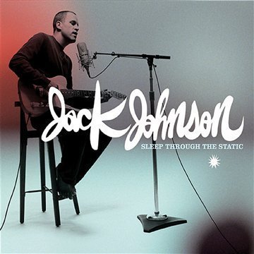
The image uses rule of thirds making it a neat way in presenting the front cover. The image is the first thing your eye is drawn to as the bright colour (red) gives the star more prominence. He is in mid-performance which suggests he passion and ambition for performing, along with himself, the stool and the microphone stand to be black allowing the eye to make assumptions that the star is loving what he does.
The white writing is on top of the image indicating a confident man behind it. The writing is bold and the font is fancy and detailed, once again, percieving him as someone who takes care and pride in what they do. The name of the album underneath and in much smaller, less detailed writing. This exaggerates on who the person is instantly.
His prop is the guitar located in, what people would think is a studio. This allows the audience to relate to him more as a person, understanding that he doesn't live the "high life" that famous singers are stereo-typed to have. Having this could subconciously make individuals like and connect with him, broadening his fanbase.
The colouring in the background gradually gets lighter until it shines to the colour red behind the top half of his body, once again, showing a large emphasis on the star himself. It can also suggests that he is in a place he likes as people assume that bright colours are for happy people.
The image is shown of him performing live as the audience can relate to the title. The star is dressed in dark colours (particularly black), this suggests that him and the stage are one as he is passionate in what he does. He is positioned in the centre, drawing the eye straight to him so people can establish who it is. Mayer is looking at the guitar which suggests his dedication to his career and the public follow his eye line so they can make the connection as well.
The white colouring against the black background is bold making it clear for the audience to establish who it is. There is no set behind the writing making it easy for the eye to read. The writing is bold, this is used once again so it stands out. Mayer's gave the album name more prominence compared to his name which is unusal for artists to do. However, this provides a more personal album cover to his fans as they instantly know who the artist is without looking at the name.
No comments:
Post a Comment