In order for me to understand my music video, media products associated with the acoustic and alternative acoustic genre, were researched to understand the different conventions most of them applied. However, for this question I think it is essential to know exactly what a convention is!
What is a Convention?
A convention is established rules and understandings that are deployed into a specific media form, it is something that can be stereotypically known to the public so they can relate to what they see.
I looked at various music videos that consisted of the same conventions within props, narrative and performance (particularly the ratio of each), shot type, locations, props, clothes and actors.
Because I have chosen a relatively difficult genre (as it isn't as popular as others such as, pop, rock, R&B), I found it more difficult than I thought it would be, finding music videos that consisted of the same conventions, whether the artist has the same genre or not! Just Jacks music reminds me of a jukebox's as he possesses different genres with different songs, however, he dominates with alternative acoustic. The video below is an inspiration and platform in creating our music video, as the narrative in this music video is similar to what we want, using the convention!
I wanted our video to be comedy dominated. This video was the first one we both looked at. I realised that our video uses conventions for not only props but plenty others without making it a look-a-like of the actual video itself.
The majority of the public know that the acoustic genre more than likely include guitars in their music videos. However, I have developed this as it shows George not playing the guitar at all and yet it is still in shot. To me, this is amusing as you would automatically assume that the artist would be playing the guitar, and yet it is all about his voice, therefore, this adds to the comical effect we were going for.

The costume that George wears in our video and Joshua Radin (see his video above) wears are extremely similar. We saw this and thought it would be a clear use of convention of the acoustic genre to use that the audience can relate with. The clothing that many artists within the genre use are a casual look, mainly containing a t-shirt/top/thin jumper and trousers/jeans. Here are some artists that have similar clothing to George and Joshua Radin:
Benjamin Francis Leftwich.
Jay Jay Pistolet
However, George also wears a shirt and trousers in some locations which makes him look smart and yet keep into the same genre as you can see here, James Vincent McMorrow is from the same genre and wears smart clothing:
James Vincent McMorrow
I also thought this could be slightly developed in the convention as it isn't common and yet doesn't make George look like he sticks out because the clothing doesn't relate to the genre. It is also convenient as George has clothes like his genre which is something I asked him first as we didn't want to get too far and realise that this genre wouldn't be suitable.

This is another classic example of having a prop being a guitar as it fits with Faulkner's and our genre. There are loads of close-up shots of the guitar creating much more significance, allowing the audience to see the performance side of the video aswell as relating it to something the audience know acoustic artists use! This is another thing that we have challenged as the guitar is only in mid/wide shots, where it is placed in the background. This also allows the audience to make the connection, and become more personally involved in the video.
Something which I think is significant and clear in our video is that George plays a lot to the camera. I think this is important as we don't have any close-up shots of any instruments as the performance base as we are just using voice. Therefore, any exaggeration on the voice is paramount. This is a convention I feel we have developed and yet we know other artists within the same genre do it, as James Blunt does above. (Please ignore the first 10 seconds as this was the only video I could import on as the others wouldn't let me embed the details to transfer it to Blogger). People often associate acoustic artists as playing the 'reluctant' star, although Blunt is being confident in the way that he is playing along to the emotion of the song, and so it doesn't become over the top and too confident. This is something I feel George accomplishes in our video.
There are plenty of close ups on the artist which is a convention we have used. I think that this is a brilliant way to give the artist the prominence they need as it is their video and people want to know who it is. This is something which Just Jack's video, "Glory Days" stresses on also. A huge element of entertainment on this video is the changing tops that have images that relate to the lyrics. Some of the images have close-ups on them (2:13) which ultimately show that they want the public to see something significant and what will entertain them. The close-ups on George's face are in our video, I think not only is it within the acoustic/alternative genre, but within all the other genres as it is a brilliant way of promoting the artist. So a convention was used.

I asked a few people in the class what their answer would be if they had to choose an acoustic singers location for a music video. The majority of the people said in a low-key, small area. This is something I agree with, despite us developing this! Jack Johnson uses a recording studio in the official video of If I had eyes which would evidently be personal to him and I think that acoustic players do have song lyrics that can be very profound and so that location relates to it perfectly. We have used isolated spaces in some respects as it is (obviously) only through the camera what you can see, even if the locations are in the exterior. The type of camera shot can also influence whether the location appears isolated or open.
I wanted to develop this convention and use different locations mainly because it relates to the narrative of the story. For example, Ashley is playing one of his characters where he is the secretary and so he was placed behind a desk in an office environment. However, you could say that this is an isolated setting as the office wasn't big. This is something I personally think ties in well as some locations are isolated and others not, incorporating the acoustic/alternative genre which the puplic are familiar with, along with something which we developed. Other locations that we used are, outside a garage where the 'puplic' are walking by, sat on a bench, in an office, sat on the stairs. These aren't places you would associate with the acoustic genre but relate to the genre and so I think developing the convention is something we achieved.
Personally, I absolutely love this video! Not just because it has a well established actor in it which the majority of people can distinguish, but because it is funny and iconic. This is exactly the emotion we want from the audience. I had a look at the video a few times to look at different elements that make the music video so amusing and hopefully inspire me as to what we could have done to improve ours.
Despite the actor (Rupert Grint) playing a character which seems to be like the ultimate fan of Ed Sheeren which is ironic as some people would say it realistically would be the other way round in terms of fame, there are plenty of close-ups on Grint when he uses distinctive facial expressions which instantly amuse the audience. This is something we have challenged as a convention as George doesn't use many facial expression as I wanted him to play a very monotone character and let the drama around him explode and the audience would find it amusing how he isn't paying any attention or emotion as to what is going on.
Digipak:
Because the genre is acoustic/alternative, I felt that it was important to exclude connotations that weren't a part of our genre (e.g. cartoon characters, heavy fonts, extremely dark colours through out etc). I found it important to utilise different view points that the audience can relate to from the front cover and the artist else it shall becoming confusing and potentially, wouldn't sell any albums.

Our front cover consists of George and Ashley in an action shot. This is something I feel we have challenged as a convention as acoustic artists tend to have a subtle, low-key image which basically consists of just them. Here is some examples of this point:
Robert Pattinson

James Vincent McMorrow
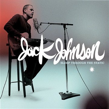
Jack Johnson
The front cover is funny which relates to the music video, and because the image is with the same characters and in the same location as part of the music video is, this all fits together well. If George was a successful star, his fans and the public may distinguish that his personality is brought into the front cover as he is funny, therefore, you are making it much more personal for his fans as well, without having it disguarded by others as you can clearly see the bold writing of his name and image.

Note here that the audience (particularly fans) can establish that the location is where the music video was shot. I think that it is difficult to identify certain locations with the genre acoustic, as different artists where from different social classes and backgrounds. This is the main reason why I didn't want to have a location on the front cover that signatures this.
The writing is something which I think we have developed as a convention. However, I think that this is something that can vary not just in different genres but within the whole music industry. Although, this is the one thing I would have changed because of the colouring of the writing compared to the background colour as I feel it wasn't striking enough. I think the writing has to relate to the rest of the CD cover, for example, you wouldn't have Marilyn Manson's devil like image in his album Lest we Forget in fairy-like bubble writng. But I didn't want to have bold, black writing (unless it went well with the cover) as this has been done many a times. This is why I feel that we have developed the convention, as other acoustic artists do tend to stick with the black writing:
Tom Felton
John Mayer
Basic conventions that were used and would have to be used to publicise the CD cover are:
- Record Label
- Website
- Artist and album name
- Bar code
- Song titles
Not only does this type of genre use the conventions above, all the music industry would as it promotes their music and gives them the information they need to know without piling on lots of information. I particularly felt that it was important to place the record label onto the CD cover as it is a well established label which people would be impressed by and a brilliant persuading technique. The sepia colour of our digipak was used because the alternative genre influenced me to have an alternative colour.
The composition is extremely different to other artists as it usually just has the character of them. However, our composition isn't just taken up by George, but Ashley aswell! They both have around half of the CD cover, even though Ashley is the dominant character as he is standing infront of George, whilst he is sat down behind him. This is a convention we have developed from not having just the artist, it brings the humour out of the audeience which we have wanted in the first place and creates the effect of a story just on the front cover! I don't think this is too revealing on Ashley rather than george as you can clealy see George in the image and can make the connection of the video to the album cover!
I did some research on other posters and albums and notcied that plenty of artists have if not the same, then similar posters! This is something I wanted to do as the aim of the poster is to advertise the album and having them both similar is easy for the audience to make that connection and potentially, sell more albums! However, I didn't keep it the same, changing the background from a sepia effect to black and white as I felt that stood out more and because the poster is A4 size, It gives more room than the CD cover size, and I wanted to use this to my full advantage.
We changed the colour of the writing on the "OUT NOW" to blue as this is advertising the album and so I felt that that peice of information was the most important thing on the advert. We also took of the release date, purely because this doesn't make sense when you have the writing "OUT NOW" on there. We placed the iTunes, HMV and Spotify logo onto the music video also to show that the album is released, and in all the big music stores. They were in red which is the most striking colour that you look at!
Having looked back at what I have wrote, 6 conventions I used, 4 I developed and 3 I challenged. This is something I am very happy about because I want the public to have a well established thought about which genre our music video is and, therefore, they understand why we chose certain things, like having a similar outfit for George compared to other stars. However, this also shows that we haven't just copied conventions of different acoustic/alternative artists and had an idea of what we wanted anyway; that mainly consisting of a comedy narrative.

 We used Adobe Photoshop CS5, to put our poster together (along with our CD). All of the Adobe software is what is available on the iMacs we use in class.